Luxury retail · Cartier boutique backlit gold facade + delivery service
Cartier Boutique Backlit Gold Facade — Service, Delivery and Problem-Solving
How a backlit gold metal facade was delivered for a Cartier boutique: the brand brief that fixed the finish and the light, the eleven delivery gates, the nine worries Cartier's design team raised before the first panel was cut, and the set-out, frame and light measures that answer each one — photographed in the workshop and on site.
The project
A closer look at the brief.
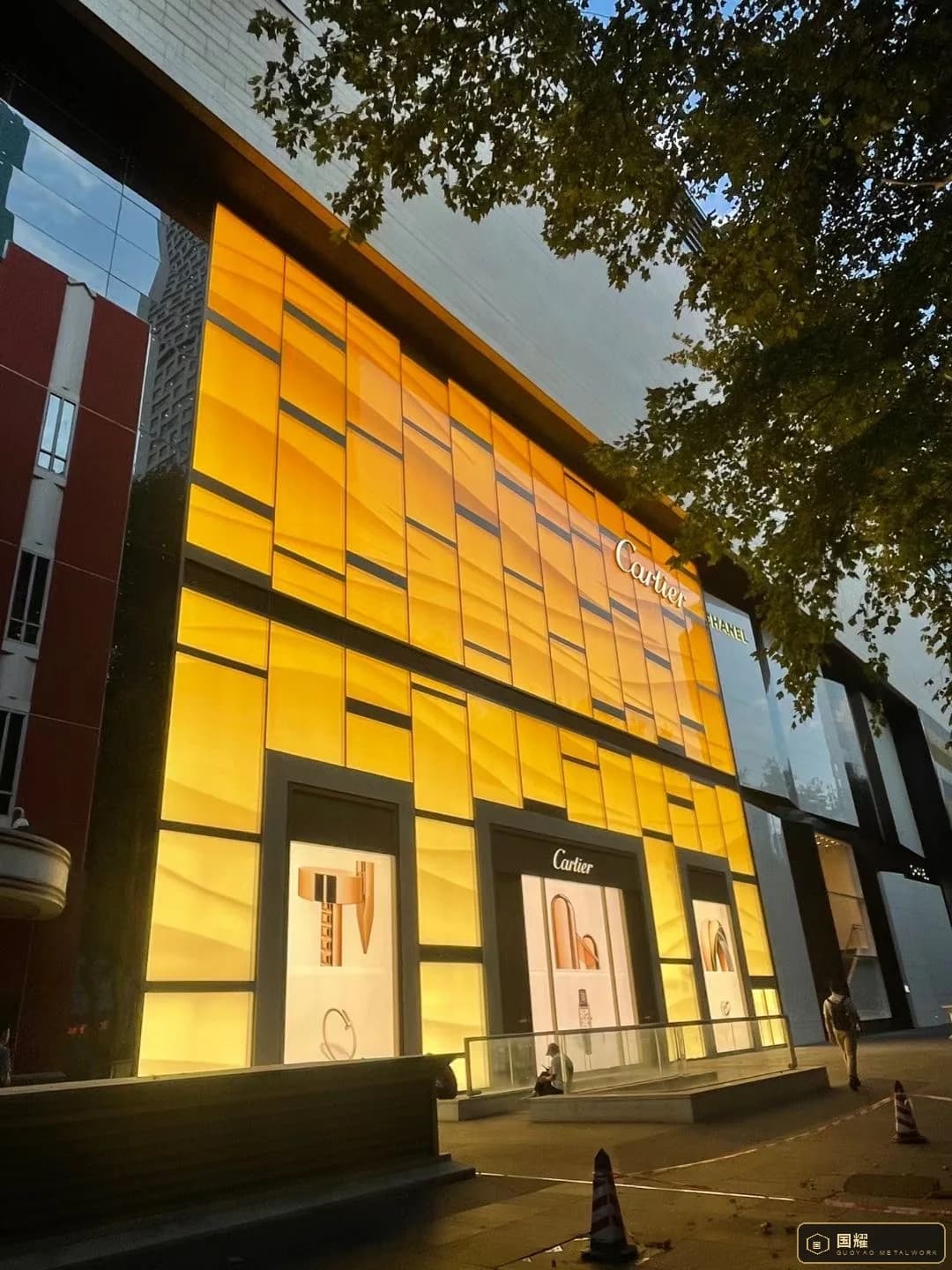
The maison has been dressing its shopfronts for more than a century and the vocabulary has hardly moved: a stone frame, a vitrine, gold, and the name in the right letters at the right height. What has moved is how much of that elevation is now metal. Here the whole upper storey is a screen of brushed gold-bronze panels — dozens of them, each a different size, set in an apparently random patchwork of recessed joints — with three display windows cut into the base, the Cartier name in letters across the top, and a cavity of lamps behind everything. In daylight it is a metal screen. After dark, lit from behind, it becomes a single amber field, and every joint, every panel edge, every half-millimetre of wave in the sheet is legible from the pavement. The design was Cartier's. This article is about the other half: what it takes to deliver a brand's drawing — eleven gates, nine worries the maison's design team raised before a single panel was cut, and what we did about each one. The boutique at dusk, half daylight and half lamp — the twenty minutes when the elevation is neither metal nor light, and both judgements are being made at once.
- Delivery gates, each with a written sign-off
- 11
- Full-size panel and joint mock-up, lit from behind
- 1:1
- Joint width tolerance across the backlit field
- ±0.3 mm
- Conditions every panel is judged under: daylight, 3000 K, off
- 3
- Light leaks accepted at handover
- 0
01 / 00 · What clients buy
Nobody buys a facade. They buy the evening the lights come on and the gold is still one colour.
On a Cartier boutique the object and the process cannot be separated. The elevation is fixed by the maison's artwork, the colour by two very different light sources, and the programme by a shopping centre that never actually closes. What the brand is really purchasing is three things at once — and all three are judged in public, on opening night, with the press outside.
Most facade failures on a luxury fit-out are not failures of skill. They are failures of sequence — a finish applied before the geometry was proven, a panel cut before the opening was surveyed, a mock-up signed off in daylight and installed under lamps. On a maison's shopfront those failures have witnesses: the opening night has a guest list. The service exists to put the sequence right.
The face the maison drew
A screen of flat gold-bronze panels in an irregular patchwork, separated by recessed dark joints, hung on a galvanised sub-frame, lit from a cavity behind. Each panel is a different size and sits at its own position in the pattern; the composition only reads if every joint lands exactly where Cartier's elevation says it does — including where a joint is not allowed to land, which is anywhere in the lettering.
The certainty that it is still Cartier
That the gold approved on a sample board is the gold that arrives on site and the gold the maison's own design team signs off at night — that no panel shows a grey cloud when it is lit from behind, that no joint leaks a bright line, and that nothing has to be re-made from a cradle in front of a trading boutique.
The record the brand can audit
A dossier that outlives the fit-out: which panel hangs where, what finish batch it came from, which driver feeds which field, which mock-up revision the maison approved, how a panel comes off when a lamp fails in year six, and what to clean it with so the brushed grain is not polished away.
02 / 01 · The brand brief
Cartier does not buy a gold wall. It buys a screen that is recognisable at forty metres, in the dark.
A boutique facade answers to two authorities at once, and they ask different questions. The maison's design team asks whether the elevation still says Cartier — the proportion, the gold, the lettering, the calm. The landlord's architect asks whether it complies with the centre's facade manual — set-backs, signage zones, luminance, cleaning access. Both have to be satisfied by the same set of shop drawings, and neither will accept the other's answer as their own.
That is the first thing we ask a client to confirm, before a tolerance or a price: who signs, and in what order. On this package the two tracks ran in parallel from gate 03, with one drawing set issued to both, one revision register, and every comment answered in writing. It added about two weeks to the drawing stage and saved considerably more than that later, because the two authorities were never allowed to discover a conflict on site.
The brief also fixed the vocabulary we used for the rest of the job. “Cartier gold” was not a colour name on a swatch; it became a specification — alloy, brushing direction, gloss unit, and a colour temperature the gold had to hold under. Once those four numbers existed, a panel could be judged in Foshan against the same standard the maison would apply in the street, and both parties could point at the same document instead of at each other's memory of a meeting.
Two approvals, one drawing set. The brand's design authority and the landlord's facade reviewer were answered from the same revision of the same drawing. Where their comments crossed — signage illumination, the set-back of the lettering, the access panel behind the screen — the conflict was resolved in a three-way call and recorded as a drawing note, not as an email.
The silhouette, first
Before a single joint is read, the elevation has to give the boutique its shape: a tall calm field above the vitrines, the name where the eye expects it, nothing else competing. Any extra graphic device — a bright reveal, a shadow line with a rhythm of its own — steals that read.
The windows lead
At night the vitrines must be the brightest thing in the composition. If the gold screen overtakes them, the boutique becomes a lightbox and the jewellery loses its stage. Screen luminance is therefore designed below vitrine luminance, not at the maximum the lamps can give.
Nothing that reads as a joint
On a luxury elevation every visible line is a design decision. Panel joints are allowed to be thin and even, never wide, never doubled by a fixing line 20 mm away. Concealed fixings, one joint width, one grain direction — the discipline is what makes the screen look expensive.
03 / 02 · Delivery gates
Eleven gates from the first survey to the night Cartier opens
This package passed through the same eleven gates as every facade we deliver. Each gate produces something the client can hold or sign, and each one is a place where a problem can be stopped cheaply instead of expensively. Gates 01–05 happened before a single finished panel was cut; that is deliberate, and on a brand project it is also the only period in which a design change is free.
| Gate | What happens | What the client receives | Decision taken here |
|---|---|---|---|
| 01 | Design assistBuildability review of the screen and its light cavity, against the maison's artwork | Comment sheet with three buildable options: panel size, joint width, frame depth, cost band | Which geometry is affordable |
| 02 | Survey & digital twinTotal-station survey of the opening, structure, glazing line and brand boundaries | As-built model, deviation report, fixing and access check | The real numbers, not the drawn ones |
| 03 | Shop drawingsPanel breakup, joint map (kept clear of the lettering), set-out coordinates, removal strategy, interfaces | Sealed drawing set (rev A → B → C) issued to both the maison's design team and the landlord's architect, with a panel-by-panel key plan | Where every joint is allowed to be |
| 04 | Mock-upFull-size panel pair with the real joint and the real lamp behind it, reviewed on site by the brand team | Mock-up photographs and a dimensional report under daylight and 3000 K, signed by the maison | Whether the design survives at full size |
| 05 | Material & finish approvalSubstrate, shade, brushing direction, gloss, LED colour temperature | Physical A/B/C sample board with gloss and colour readings, signed finish schedule, retained control sample | What “Cartier gold” means on this job |
| 06 | Tooling & framesJigs, sub-frames, cleats, lamp brackets | Tooling record and a first-article frame measured against the model | Whether the frame is repeatable |
| 07 | FabricationCutting, folding, welding, dressing, grain, polishing | Dimensional report per panel; weld map; material traceability | Whether to release the next panel |
| 08 | Trial assembly + lit inspectionElevation dry-fitted on frames, lit from behind, checked from street angle | Trial-fit photographs, joint alignment record, panel numbers matching the key plan | Whether anything goes to the site |
| 09 | Surface & protectionFinal finish check, film, edge protection, rack order | Finish certificate, batch records, protection and packing schedule | How the finish survives the road |
| 10 | InstallationSequence, lifting, brackets, shimming, night works | Daily site report with photographs, snag list, as-installed deviation record | Where tolerance is absorbed |
| 11 | HandoverDossier, cleaning regime, lamp schedule, spares, brand sign-off record | Twelve-document handover pack and a maintenance card for the boutique team | Who owns the screen after opening |
04 / 03 · Designer's nine worries
What Cartier’s design team asked us before a single panel was cut
These are the questions the maison's design team raised in the second workshop, after the artwork was approved and before the order was placed. They are not objections — they are the risk list of anyone who has watched a branded facade go wrong in a street. The list arrived with the landlord's facade-review comments attached; we answer both in the same order.
Wang Haifeng · Design director, GUOYAO METAL
“A backlit panel has nowhere to hide. The lamp is the most honest inspector we have — and on a brand's building it is also the most public one.”
| # | The worry | Why it happens on a lit screen | What we do about it |
|---|---|---|---|
| 01 | “Will it still read as Cartier at night, or just as gold?” | A brushed bronze-gold is a directional finish; a 3000 K lamp behind it shifts it warmer and flatter than street light ever will, and warm gold is not exclusive to one brand. | One coil allocation, one brushing direction and one finishing line for the whole package. The sample board is read in daylight, under the specified 3000 K, and with the lamps off — all three signed by the brand team before gate 07. |
| 02 | “Will the screen outshine the vitrines?” | The screen has far more area than three windows; lit at full output it wins the street, and the jewellery becomes a detail inside a lightbox. | Luminance is designed as a hierarchy: vitrines first, screen second, lettering third. Cavity depth, lamp pitch and driver dimming are set so the screen sits measurably below the vitrines — measured with a meter at the pavement, not judged by eye. |
| 03 | “Will a joint run through the lettering?” | The panel layout comes from the artwork, the letter positions come from the signage contractor, and the two are rarely drawn together at 1:1. | The letter centrelines are a fixed point of the set-out at gate 03; panel splits are moved — by 40 mm where necessary — so no joint, fixing or shadow gap lands inside a letter or within its optical margin. |
| 04 | “Will the joints read as a graphic grid?” | The patchwork is irregular by design, so there is no continuous line to hide an error behind — and a wide or doubled joint turns a calm field into a pattern. | One joint width, ±0.3 mm, everywhere. Every panel carries a grid reference, its own size and its four joint widths; fabrication and site work from coordinates, never from a scaled print. |
| 05 | “Will the colour drift between panels?” | Two coils finished on different days sit side by side on the same elevation, and the lamp makes the difference louder than daylight does. | A retained control sample per package; every panel read against it under 3000 K before packing; any panel that fails is re-finished rather than argued about. |
| 06 | “Will the vitrines and the screen read as one composition?” | Three display boxes, the brand letters and the screen are made by different trades, and a 5 mm reveal mismatch is enough to break the elevation. | An interface matrix at gate 03 fixes the reveals, the shadow gaps and the letter centres; the shopfitter and the signage contractor sign the same drawing we fabricate to. |
| 07 | “How do we service the lamps without closing the boutique?” | An LED cavity behind a sealed screen is a maintenance trap; a failed driver should not mean a scaffold on the pavement in front of a trading store. | Panels are removable on concealed fixings, numbered to the key plan, with a removal order printed on the handover drawings and a driver schedule mapping each field to its isolator. |
| 08 | “Will the heat behind the panels move them?” | A closed cavity warms up; differential expansion between frame and skin shows up as a bow in the middle of a panel. | The cavity is ventilated top and bottom, lamp spacing is fixed by the model, and the skin is isolated from the lamp brackets so expansion is taken by the fixing slots, not by the face. |
| 09 | “If it does not fit, who pays?” | By the time the screen is on site, the artwork, the structure, the brand's approval and the contract may all disagree. | One party owns the survey, the mock-up, the fabrication and the installation. Any deviation from the approved model is our cost, in writing, at gate 03. |
05 / 04 · Set-out & coordinates
The pattern is a coordinate system, not a picture
Cartier's artwork arrives as a rendering. It has to leave the office as numbers, because an irregular patchwork cannot be set out by eye and cannot be corrected on site. Five things fix the elevation: the finished floor level, the glazing line, the centre of the brand letters, the boundary with the neighbouring store, and the top of the light cavity. On a live mall, none of those five are where the drawing says.
We survey all of them with a total station before anything is cut, then rebuild the artwork over the survey. Every panel gets a grid reference, its own width and height, its angle if it has one, and the joint width on each of its four sides. What looks like spontaneity on the elevation becomes a table of coordinates — and once it is a table, it can be fabricated 9,000 km away and still land in the right place, under the right letters.
The frame absorbs the structure. Concrete is never as square as the model: if the opening is 12 mm out over its height, that 12 mm is taken out in the bracket zone, never in the joint. The joint width is the one dimension on this facade that is not allowed to move, because it is the only thing the eye can measure from the street — and on a brand elevation, an uneven joint is read as a cheap one.
06 / 05 · Jigs & sub-frames
The face is decided by the frame, not by the polisher
A thin metal panel is a membrane: it takes the shape of whatever holds it. If the frame is straight, the panel is flat. If the frame carries half a millimetre of twist, the panel becomes a shallow saddle — invisible in the workshop and unmissable under a lamp.
Every sub-frame on this package was built in a jig, with the diagonals checked before the cleats were set. Cleat positions came from the model, not from a tape measure, and the lamp brackets were located on the same jig so the cavity depth stays constant across the elevation. Each frame carries its grid reference stamped on an edge that will never be seen again after installation.
This is the part of the job that no client photograph ever shows: rows of galvanised frames on trestles, checked, numbered, and waiting for a skin that has not been cut yet. It is also where a facade is won. By the time the panels arrive, the geometry has already been decided.
07 / 06 · Flatness under backlight
A backlit panel cannot hide: flatness is the finish
In daylight a brushed gold panel forgives almost everything — reflections move, the street is busy, the eye is not patient. Lit from behind, the same panel becomes a screen: any wave in the sheet reads as a pale cloud, any over-polished patch reads as a bright spot, any edge that does not sit down reads as a halo.
Three decisions carry the face. The sheet is specified with a flatness grade rather than a thickness, because thickness is not flatness. The stiffener layout comes from the model so that the panel is supported where the light will show it, not where the frame happens to run. And the grain is applied in one direction across the whole package, at one pressure, by the same hands — because a brushed finish is a direction as much as a colour, and on a Cartier screen a grain that changes direction between panels reads as two different golds.
Edges get the same attention as faces. The return is closed and dressed so that no light escapes around the perimeter of a panel, and the last 20 mm of every edge is polished with a fresh mop: a burnished edge reflects the cavity and shows as a bright border even when the joint detail is perfect.
08 / 07 · Light as the inspector
We test at night, because that is when the boutique is judged
A lit screen is a lighting project that happens to be made of metal. The lamp pitch, the distance from the panel, the colour temperature and the driver grouping decide whether the elevation reads as one warm field or as a grid of bright centres with dark corners between them — and whether the gold still belongs to the brand that commissioned it.
The cavity on this package is ventilated, lined to avoid hot spots, and split into fields so that a failed driver takes out one field rather than a stripe across the elevation. Lamp brackets were positioned from the model — a 20 mm change in cavity depth is enough to move a hot spot from the middle of a panel to its edge, where the joint makes it obvious.
The hierarchy was set here, not at the end. The three vitrines were lit first and measured; the screen was then brought up only as far as it could go while staying below them. It sounds like a small thing and it is the whole commercial logic of the elevation: the boutique is selling jewellery, not lamps, and a screen that outshines the windows has taken the stage from the product.
Then we switch the workshop lights off. The trial assembly is lit with the project’s own lamps, at the project’s own colour temperature, and inspected from the angle a person on the pavement will actually stand at. Joints are walked with a light meter and a straightedge; leaks are traced to the panel edge or the frame return and fixed before packing. This is the inspection that decides whether the facade ships.
09 / 08 · Protection & packing
The finish survives the road, or the project was wasted
A brushed gold-bronze surface is a finish, not a colour: it has a direction, a gloss level and a batch. It also has an enemy — the weeks between the last polishing mop and the night the film comes off in a mall service yard.
Long panels do not travel well in a container. This package was racked: flat racks, braced, with the panels standing on their long edge and separated by soft packers, so that the face never carries load and the frames cannot rack out of square. Every rack was photographed loaded, and every panel number on the rack matches a line on the set-out key plan.
10 / 09 · Installation
Two nights in a mall that never closes, for a brand that opens on a date
The landlord never sees our delivery; the shoppers only see the result. Between those two facts sits the whole installation: a goods lift booked in ninety-minute windows, a service yard that has to be handed back clean before the first shop opens, and an elevation that has to be aligned from the datum again every night. And behind all of it, an opening date that Cartier has already published.
Installation runs from the top band down and from the datum out, so every panel is hung against a line that has already been checked rather than against the panel beside it. Each night ends with a joint walk, a light test at full output, and a photograph of the elevation as it will be seen from the street. Snags are logged the same night, while the panel that caused them is still accessible.
The last two hours of the last night belong to the maison's designer: film off, lights on, one walk along the pavement. That is the moment the elevation is either accepted or not — and it is planned for from gate 01, not improvised at the end.
11 / 10 · Problem log
Five things that actually went wrong on the Cartier screen — and how they were closed
A service article that reports no problems is a brochure. These are the issues logged on this package, in the order they appeared, with the process change each one produced.
The first lit panel showed a cloud
The first panel was flat on trestles and looked perfect. Lit from behind at 3000 K it showed a soft grey patch across the middle — a wave of about 0.4 mm, pulled in by a stiffener that ran where the frame ran instead of where the light would look. Closed by: the stiffener layout was re-derived from the model, the skin was re-fixed with a tensioned bond pattern, and a lit inspection at gate 08 was made mandatory for every panel — from the street angle, with the project’s own lamps.
Joint lines drifted across a run of panels
Three panels in the second band were set out from the panel before them rather than from the datum. By the third panel the joint had opened by 2 mm — invisible in the workshop, obvious against a lit field, and impossible to correct by shimming. Closed by: every panel is now marked with its grid coordinates, not just a running number, and each band is set out from a laser datum re-established at the start of every shift. A tape measure is no longer a setting-out tool on this kind of elevation.
The first sample read brass, not gold
Our first finish sample passed every internal check and was rejected by the maison in one minute. Under the 3000 K lamps it went yellow-green; in daylight it was correct. The brand team's word was “brass” — which is not a colour error a spec sheet catches, because the spec sheet had been written in daylight. Closed by: the colour target was re-derived under the project's lamps rather than under the workshop's, a cooler bronze-gold was developed and read against the retained control sample at three angles, and the approval sheet now records colour temperature as a condition of the finish, not as a lighting note.
A bright line at a vertical joint
One joint leaked. The gap itself was correct; the frame return behind it was too shallow, so light bounced once and came straight out as a thin bright line that read as a scratch on the elevation. Closed by: a labyrinth return was added behind every joint, deep enough that light has to turn twice. The detail was changed in the model, applied to the remaining panels, and tested at night before the rack was closed.
A panel split landed inside the lettering
The artwork put a horizontal joint 15 mm above the base of the brand letters. At 1:1 it did not read as a joint; it read as a shadow under the name. Two panels were already cut when the mock-up made it obvious. Closed by: letter centrelines became a fixed set-out point at gate 03, and the affected panels were re-cut with the split moved 40 mm down and the pattern adjusted around it. On branded elevations, every joint now has to clear the typography before it can be released.
12 / 11 · Handover dossier
What Cartier is left holding
The dossier is not paperwork for its own sake. It is what allows a boutique team, a facilities contractor or a future designer to touch the screen without guessing — and what allows the brand to prove, years later, that the elevation was built to the standard it approved. Twelve documents, one folder, delivered before opening.
“The opening night is not the end of the project. It is the first evening the maison owns what we made.”
As-built drawings
— the elevation as installed, revised to site
3D model
— native file, with the set-out coordinates
Survey & deviation report
— opening, structure and glazing as found
Material certificates
— sheet, coil allocation, alloy and grade
Panel map
— every grid reference, size and joint width
Weld map & welder records
— panel by panel
Dimensional report
— control points at trial assembly
Finish schedule
— shade, gloss, grain direction, batch id
Brand sign-off record
— mock-up, finish and night inspection approvals
Lighting schedule
— CCT, lamp type, driver list and isolators
Maintenance card & spares
— what to clean with, what never to use, one finished panel section held
Removal & protection schedule
— film grade, panel order, access sequence
13 / 12 · Start here
Three things get you a real answer in 48 hours
We do not quote a lit facade from a photograph. Three inputs are enough for a buildability review, a realistic tolerance and a delivery programme — and they are the same three that decided whether this Cartier elevation would read as one field of light.
Send those three and you will receive a buildability comment sheet, a joint and flatness tolerance schedule, a finish recommendation and a gate-by-gate delivery programme — before any commercial discussion.
The elevation and the brand standard
Opening dimensions as built, the artwork or pattern intent, and the brand's facade guideline if one exists — DWG, Rhino, SketchUp or a dimensioned PDF.
The light and the finish
Colour temperature, lamp type, cavity depth and how bright the vitrines will be, plus reference images for the metal. On a backlit screen, “gold” is a lighting decision as much as a coating.
The dates and the approvers
Opening night, mall access windows, and who signs for the brand and for the landlord. The programme is built backwards from the opening, not forwards from the drawing.
Project reflections
From the brief to the detail.
GUOYAO METAL · Architectural metalwork for luxury retail, offices, hotels, residences and museums Cartier boutique · Backlit gold facade · Workshop and site record Project reference. Cartier is a registered trademark of Cartier International SNC. The name is used here only to describe the delivery of this facade; GUOYAO METAL is an independent architectural metalwork fabricator and is not affiliated with the maison.